MOBILE SEO PART 1 – Introduction and early Steps
What Is Mobile SEO?
Mobile SEO is the process of optimizing your website for users to easily access it on phones and tablets. Mobile optimization gives users a different positive experience since it looks flawless on any device regardless of the screen size.
Why Is Mobile SEO Important?
In the past few years, the usage of mobile has increased tremendously. People are spending more time on their mobile devices. Most of the searches are happening on mobile nowadays. As per research over 76% of online shopping happens from mobile and this number will increase in the future because mobile phones are easily accessible. Even Google is focusing its updates and algorithm on mobile search.
What factors affect Mobile SEO
There are multiple factors affecting Mobile SEO. These include Design UI & UX, Page Speed, Image Optimization, Bounce Rate, Mobile CTR, Coding Optimizations etc.
We will cover all these factors in a three-part series.
Let’s look at a few major factors affecting Mobile SEO in this article.
Design UI & UX
It is old news that search engines have moved on from just keywords and backlinks for SEO ranking.
Search Engines now consider many more factors like
* how the user interacts with the page,
* how much time user spends on the page,
* if the page answers the user’s queries properly or
* if the user is still searching for similar information on other websites.
All these factors are summed up as the user experience on the webpage
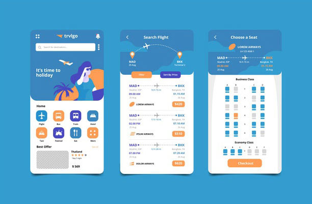
The website’s UI & UX plays a major role in Mobile SEO as it defines how the user interacts with and experiences the website. This has a profound effect on whether the website is helpful for the user.
UX is a big part of SEO owing to Google’s RankBrain Algorithm
With all these factors, it becomes important that the user has the best and most valuable experience on your website to get ahead of the competition in SEO.

Responsive Web Design
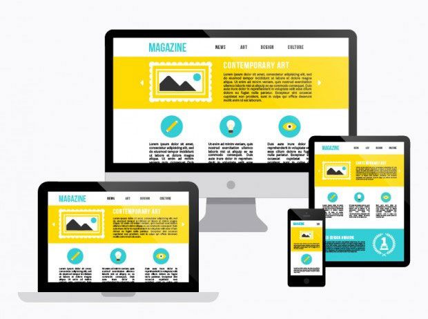
With Responsive Web Design, your webpage’s layout and content are easily displayed to the user on the device of their choice
Benefits of Responsive Design
- Content optimized to be displayed for the best experience based on screen size.
- Easier to maintain as all of your content is on a single URL (benefits in sharing and getting links)
- Similar design
- Extremely user friendly
- No redirects (Which helps to maintain the site speed)
How your Responsive Site Looks from a User’s Perspective
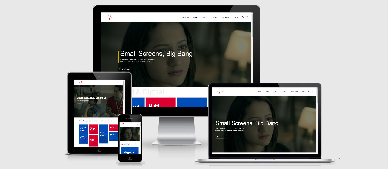
Responsive sites help your user to experience your site in different devices as per their comfort. So if you use responsive design on your site you should check how it appears in different device formats. Check out how your website appears on different devices here

(Image Source – https://itexperts.co.za/)
Avoid Flash
This plugin may not be present on your user’s phone, which means they’ll miss out on the experience you designed for them. If you want to create special effects, use HTML5 instead.
Avoid Popups
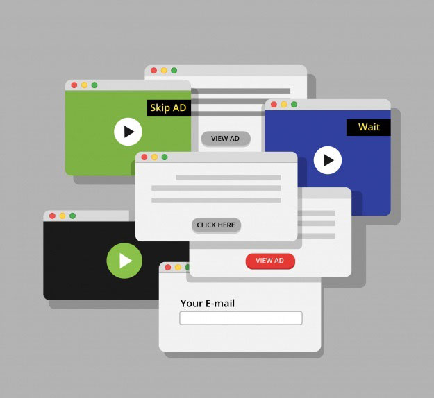
Who doesn’t hate pop-ups? Even Google hates pop-ups, especially for mobile users. Google’s job is to provide it’s users an amazing experience. If that content is hidden behind a popup it’s a big fall. Google has specially rolled out an update that specifically targets “Intrusive” pop-ups. This may lead your site to lose ranking. Check out the update: Google Algorithm about “Intrusive pop-ups” for details
Make Content Readable on Phone
- Use at least 15-16px font
- Use short paragraphs which contains 2-4 lines per paragraph
- Go with a line length between 55-60 characters
- Make sure to maintain a good contrast between text and background. People use phones outside in bright light, Por contrast results in readability issues and ultimately a bad user experience.

Avoid Popups
Who doesn’t hate pop-ups? Even Google hates pop-ups, especially for mobile users. Google’s job is to provide it’s users an amazing experience. If that content is hidden behind a popup it’s a big fall. Google has specially rolled out an update that specifically targets “Intrusive” pop-ups. This may lead your site to lose ranking. Check out the update: Google Algorithm about “Intrusive pop-ups” for details

The Benefit of “Negative” Space
Negative space is a really important factor when it comes to mobile devices. Negative space is between text, buttons, and design. Negative space gives a better experience to users. The proper use of negative space can help you decrease the bounce rate of your site.
Add “Viewport Content” Tag
The viewport meta tag changes the size of your page based on the user’s device. Google recommends you set up a viewport meta tag for a better user experience. If you have not implemented this tag, or if it’s not implemented the right way, your site could look shabby to mobile user’s.

Image Source – www.seoptimer.com
Add “Viewport Content” Tag
The viewport meta tag changes the size of your page based on the user’s device. Google recommends you set up a viewport meta tag for a better user experience. If you have not implemented this tag, or if it’s not implemented the right way, your site could look shabby to mobile user’s.


